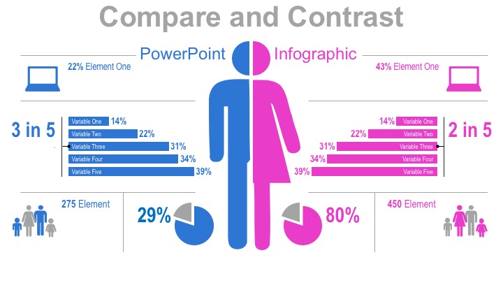

If you have two similar data sets, this PowerPoint graphic makes for an excellent side-by-side comparison. Every piece of the template–words, shapes, and all–can be manipulated at your will.
Shapes

Each of these gold-colored shapes is changeable. You can easily change colors, sizes, shapes, or remove pieces entirely if you so choose. The bar charts can be resized depending the data you’re comparing.
Text

All the text in this infographic (again, shown in gold) can be changed as well. Use whatever titles, captions, or data best get the point across. You can also change colors, typefaces, and font sizes.
Demographics
 If you have just a little imagination, you don’t have to limit yourself to statistics regarding gender. Here, some items have been tweaked to show differences and similarities between German women with Irish women. To do this, the male half of the male/female shape at the center (1), has been deleted. Then the female half is duplicated, flipped horizontally, and given it a new color scheme. This gives us two female halves, one German, the other Irish. The male/female labels (2) have been switched out for more appropriate labels. Finally, the little families at the bottom corners (3) have been changed. The males have been taken out, leaving two females, a woman and a girl. Then it’s just a matter of resizing, repositioning, and recoloring all items that don’t fit the new color scheme, and at last, we’ve got ourselves a whole new infographic.
Other Data
 And don’t feel like you have to limit yourself to just people. Delete all the human shapes and replace them with two new items you’d like to compare. In the example above, we’ve replaced the human shapes with sun and moon shapes and turned the male/female label into a day/night label. Again, we now have a completely new infographic with minimal tweaking.
Recent Comments