If you are involved in project management, then you might have heard of a Gantt chart, or seen one without knowing what it is. These are useful charts that help you visualize the stages of a project across time. You can then use this information in presentations, for clients, for staff, and any other stakeholder who wants to know what to expect from the project at different points in time. In this post, I will explain what these charts look like and how to use them because they work for a wide range of applications and industries.
Start by downloading one of our Gantt Chart templates for PowerPoint.
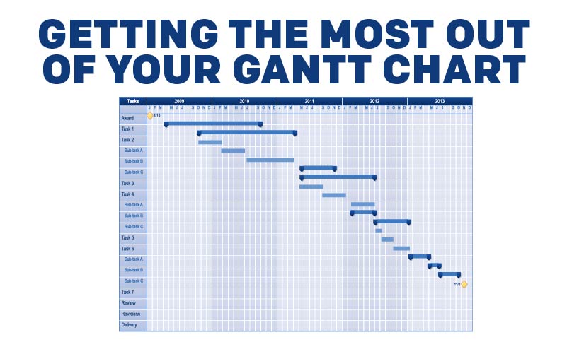
Click this image to view the graphic in the library.
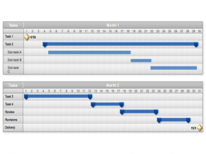
In essence, you will be charting how much time each stage of a project is supposed to take. To do this, you will need to do a little bit of setup. First, fill in the first column with the names of every task in your project, starting with the first one at the top and finishing with the last one as the final entry at the bottom of the column. Next, you will work on the first row. From left to right, fill in that row with time periods that make sense for the duration of your project. I frequently use each column as a day and have multiple sections for each month, but it is up to you. You can also take up more than one row if you want to give more details. For example, the top row can be the Development phase and the second and third rows can break out into graphic design and programming. There are a lot of ways you can choose to set it up, and it will come down to the needs of your project.
This is the basic setup, and now you have to fill it in. For each task, add a colored bar that stretches across the columns during which you expect that task to be active. For example, if you are looking at a Planning phase and you expect it to last from March to April, and you are using monthly columns, add a bar that starts in the March column and ends in the April column. Repeat this for all of the tasks.
The basic Gantt chart just uses bars, but there are a lot of ways to make them more interesting. For example, you can add dots or triangles to emphasize the start and completion dates of each task. You can use a different markers for milestones within a task, illustrating when they should be done. Charting all of this correctly takes time, but when you are done, the chart will show you a detailed look at the time use of the project. From there, you can determine when and how to use resources, provide a client with a projected timeline for the overall project, show your staff what they need to do in order to be on schedule, and more. Get creative with the graph, too. You can create a column on the far right to display the team, contractor, manager, or person responsible for each task, add vertical lines to show transitions from one task to another, or update the chart with information about your progress. For example, I like to remake the chart at regular intervals, keeping every copy. That way, I can see whether my team is falling behind, staying on target, or ahead of schedule, how that status is evolving, and which tasks seem to be farthest off the projected time of completion.
Making these charts is a lot easier if you have a good PowerPoint template to help you. That saves a lot of the manual labor involved and speeds up the process. Without a good template, you won’t want to add detail or updates. That will cause the project to suffer because it will impede your ability to communicate about the project to other people. Whether you use a template or not, a Gantt chart is one of your best tools because it presents your timeline in a visual and descriptive way.
How have you used Gantt charts in project management? If you have other practical applications for Gantt charts besides PM, let us know in the comments below!
Recent Comments