No one sits down for a presentation thinking, “Man, I really hope this bores me to tears!” Though we don’t always want to admit it, we want to be entertained. We want to see and experience something that pushes our buttons, something provocative that stimulates the mind. That’s why any presentation worth doing is worth doing in a way that moves people, in a way that is, for lack of a better word, artful.
While you’ll often hear from laymen that “there are no rules” when it comes to art, there are actually many principles that a skilled artist will follow to achieve their desired effect. Here are some principles to follow in art and in your presentations.
Balance
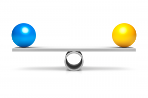
Unless you are purposefully breaking the rules to make an artistic statement, a good piece of art needs balance. Simply put, if you placed the piece of art across a seesaw, does it look like it would stay parallel to the floor, or would one side droop downward?
Presentations need balance too, not just in artistic composition, but also in rhetorical content. Try to get your information and data from a variety of reputable sources, especially if you’re presenting on a controversial topic. Otherwise, your argument may come off a little lopsided.
Emphasis
What is the most dominant element of your piece? There lies your emphasis. For instance, the emphasis of the Mona Lisa is Lisa herself. While there are other things in the painting, our eyes are drawn directly to Lisa and we place most of our attention there.
Before doing anything else design-wise, it’s important to know exactly what it is you want to communicate with your presentation. Do your research and figure out which facts support the overall mission of the presentation, and which are superfluous. With that in mind, you can organize your thoughts and figure out what your “thesis statement” is, and run with that.
Movement
In static designs, movement occurs when the shapes and positioning of the design imply a directional movement. In the picture above (available in our stock image library) there is a clear movement up and to the right. Though it’s entirely possible that this man is being blown backwards by a strong wind, it’s still a safe bet, based on his stance, that he is moving quickly toward the right.
You can incorporate movement into your presentations literally with all kinds of fancy transitions and animations, but be aware that a little goes a long way. But the more effective way of making movement is implying it in static designs. A well composed dynamic image can work wonders for spicing up your design.
Unity
Unity is a concept that is difficult to pin down, but you know it when you see it. The long and short of it is that the design feels complete and consistent. All the elements come together to create something whole. The above image is the underside of a dome in the tomb of the medieval Persian poet Hafez, and it is a great example of unity. Whether the design is to your liking or not, it shows an incredible attention to detail, making sure none of the individual tiles that make up what you see clash with one another, and that each of them serves a purpose in the overall design.
You can see unity in your presentation when you ensure that all the design elements work together consistently. You wouldn’t make one slide of the presentation with a circus theme, and halfway through decide you want Wild West cowboy aesthetic. The juxtaposition calls attention to itself, and takes your audience out of the headspace you were trying to cultivate.
Furthermore, it’s also important to make sure that the actual content of the presentation is consistent as well. If you had a presentation about astronauts, it wouldn’t make sense to mention medieval jousting apropos of nothing. Stay on track and avoid superfluous material that just distracts from your overall message.
To get yourself some graphics that are pieces of fine art in themselves, see our Stock Image library and download today!


Recent Comments