Presentation developers and designers cross over into a lot of different realms. For example, they need to know how to create content that will be effectively retained by the audience (which is in the realm of Instructional Design). Another big area that presentation developers cross into is that of the Graphic Designer. They need to know how to create a slide and eventually a whole presentation that keeps you focused and interested, and at the same time doesn’t distract you from the message. I recently had the opportunity to interview Nic Brown, a very talented Graphic Designer, and asked him, “What 5 things should a Presentation Designer always keep in mind while developing a presentation?” Here is his response.
1. Create and Use Vector Art (PC Specific):
“Creating vector art in Illustrator and exporting it as a .emf and then importing it into PowerPoint is probably the best thing you could ever do, because it retains the qualities of a vector.” As I questioned him on this topic and asked how is that important for people developing presentations, he said that it allows for the user to scale the image to any size and ratio without losing the quality of the image. “You can scale as large or as small you want without losing quality.” And a .emf in PowerPoint will allow you to change any of its colors and line points natively. You don’t need to go back into Illustrator to make small line point or color changes. This means developers can use the same image in different presentations as edits are easy to make natively in PowerPoint. As it points out in the section header, this tip is PC specific. PowerPoint for Mac doesn’t import a .emf file correctly. It treats the vector as a .jpeg which means it doesn’t retain the qualities of a vector file. There are many third party apps that allow you to get a .emf file into PowerPoint for Mac. One of these is OpenOffice.
2. Use Animations Like You Use Salt:
“When it comes to animations and transitions, less is more.” He goes on to explain that a lot of presentations that have flashy animations tend to feel childish and like the developer didn’t know exactly what they were doing. “Of course animations are good and need to be used. Just make sure you are using animations that are simple and that can be repeated throughout the presentation without being cumbersome and overbearing on the audience.” Some of these animations include Fade, Float and Fly. In talking with Nic, I found that these animations are the ones that can give your presentation enough depth and connection with your audience without losing the purpose of the presentation. But I wanted to know when it would be appropriate to use more advanced and “flashy” animations. Nic goes on to explain, “If the animation makes sense conceptually, and will improve and support the audience’s view of the topic then go for it.”
3. Use Margins:
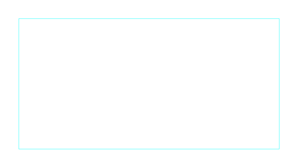
“Insert a shape into the Master Slide that outlines the appropriate amount of margin space for your presentation.” He goes on to explain that having margins and having all content within your presentation align to those margins will make your presentation so much more professional and clean. “Without strong implied margins, it looks like you threw something together at the last minute and it doesn’t give your audience enough room to ‘breathe’.” Remember that margins are meant to be implied, and unless it is apart of the design, delete your margin guide once you are done creating the presentation. A good margin width is 20-30 pixels along the border of the slide. Here is an image showing you what I mean. Also, if you click on the image you will open an image file in a new tab that you can save and place in your project to be your margin guide.
4. Keep Type Consistent:
“It is a best practice to try to keep section titles the same font, weight, size, color and position on the screen for consistency.” People need consistency and stability. And as funny as it sounds, people will find that in the format of the titles within the presentation whether they are conscious of it or not. He goes on to mention that the title font should always be different to the body text. Those are completely separate things that serve completely different purposes. “Even though you want consistency, you don’t want everything to be the same.” Be consistent in your differences. It is also important that you draw attention to keywords within the presentation. Keep it the same font, of course, but bold it or increase the type size. If you wanted, you could even add a simple Pulse animation to highlight the point. On asking what fonts you should use, he shot back, “Never use Papyrus or Comic Sans! For comprehension and attentiveness, never use those fonts.”
5. Have a Consistent Color Pallet:
“You can use the default color pallets that are built into PowerPoint, or build your own. Whichever you chose, stick to it.” If you use even a shade darker or lighter than that of your color pallet, the audience’s attention will automatically be pulled to that color. It is weird how our brains do that.
“I could talk about these things all day if I had the time,” Nic said. Which is very true! These points may seem simple, but Nic mentioned that even talking about typography and when to use them is such a huge topic of discussion. There are so many things that seem too simple to pay attention to (much like these 5 points). Keep these 5 PowerPoint design tips in mind so you don’t forget to apply them in your next presentation. Do you agree with them? Let me know in the comments section below.
Great article. The design tips mentioned above are quite helpful. This article helped me in a lot of ways.