Have you ever been sitting in the back of a conference room and unable to read a presentation because the text color was too light or the text was blending into the background? Frustrating, right?
An important part of creating a good presentation is ensuring that your content has enough contrast.
What is contrast?
As a principle of art, contrast refers to the arrangement of opposite elements and effects. For example, light and dark colors, smooth and rough textures, large and small shapes. Contrast can be used to create variety, visual interest, and drama in an artwork.
Aside from adding visual interest, contrast is also essential for content visibility and legibility. If there isn’t enough contrast between your text and the background or enough color contrast between lines on a graph, your audience is going to have trouble reading and understanding your content.
Did you know there are actual rules about color contrast?
There’s a set of guidelines called the Web Content Accessibility Guidelines (WCAG) that web developers follow to ensure their content can be accessed and read by as many people as possible, including those with visual, auditory, or physical impairments. We’ll be focusing on color contrast today, but WCAG covers many more topics.
If you work for the government or government contractors, you might be more familiar with Section 508 rules.
According to Section 508 rules, designers and developers must ensure all text elements have sufficient color contrast between the text in the foreground and background color behind it.
How do you know if you have sufficient color contrast?
There’s a fairly technical explanation involving “luminance” or perceived brightness of colors, but all you really need to know is the contrast ratio that has been set down in the standards.
Three success criteria in WCAG 2 address color contrast ratios:
- Minimum Contrast
- The visual presentation of text and images of text has a contrast ratio of at least 4.5:1. This is the bare minimum and some viewers may still experience difficulties distinguishing color differences.
- Enhanced Contrast
- Requires 7:1 contrast for normal text and 4.5:1 for large text.
- Non-text Contrast
- The visual presentation of user interface components and graphical objects must have a contrast ratio of at least 3:1 against adjacent color(s). This consideration was added in 2018.
One additional success criterion, Use of Color, dictates that color is not used as the only visual means of conveying information, indicating an action, prompting a response, or distinguishing a visual element.
Section 508 outlines the same contrast ratio guidelines.
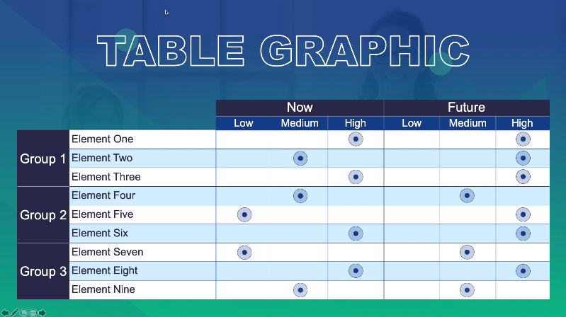
Here’s a good example of some excellent color contrast, both in the text versus background color and in the row shading of the table graphic. This template is part of the Montserrat design series in our PowerPoint graphics library.
But I’m creating PowerPoint presentations, not websites. Why do I care about color contrast?
You never know who in your audience might have a visual impairment. In addition, your audience doesn’t have the luxury of holding the screen two inches from their face. Your content needs to stand out to everyone, whether they’re sitting at the front of the room or way in the back.
There’s one last consideration that we haven’t talked about yet.
Projectors.
If you are giving a presentation using a projector, it’s a good general rule to assume the colors are going to be projected 20-30% lighter than what you’re looking at on your computer screen.
Not sure if your color scheme has enough color contrast?
Lucky for you, there are tons of color contrast checkers available online. Put in your colors and the magic of computers spits out your contrast ratio.
Here’s a color contrast checker from WebAIM that I like.
When in doubt, you really can’t go wrong with black and white. I know that may sound boring, but if you look at some of our PowerPoint templates, you’ll see that you can create many exciting designs using a lot of black and white.
Plus, we’ve already done all the color contrast head-scratching for you in our PowerPoint templates!
Download tons of templates and graphics from our PowerPoint Graphics Library to make your next presentation a slam dunk.
Not a member yet?
Sign up for a free 7-day trial to explore all the PowerPoint templates and graphics in our library.
Recent Comments