Imagine you are driving to an important client meeting. Without warning the car in front of you stops. You slam on your brakes, causing the coffee in your hand to spill and soak your shirt. It’s 1:40 p.m.; your meet is at 2:00 p.m. so you continue to the client’s office wondering how to clean your dirty shirt. You pull up to their building and notice a clothing store on the first floor. Relieved, you quickly park your car and run in to find a replacement shirt.
“Help! I spilled coffee all over my shirt, and I have an important meeting in five minutes. Do you have anything in my size?”
What is the best response you could hear from the salesperson?
“Yes, we have the perfect shirt in your size and ready to wear—and it’s on sale!”
It is exactly what you need. You buy it on the spot and rush to your sure-to-be successful meeting.
When we receive an RFP, the submitter is asking, “Help! I have a problem. Can you solve my problem within these parameters?” Our best response is, “Yes, we can solve your problem within these parameters, and this is how we will do it.”
What do we find in the first paragraph of most proposals? Most companies start with their history or list of qualifications. Rarely have I seen a proposal that starts with “we can do it and this is how.”
We want to begin our proposals with “yes” followed by a summary of how we will solve the submitter’s problem. I use a combination of text and graphics. Combining text and graphics speeds communication, improves understanding, and increases the likelihood of success by 43%. I start with a paragraph that states we can do it and this is how. I immediately follow up with a high-level visual of how we will deliver our solution.
The following are my top five executive summary “secrets”:
1. Know What You Want to Say
Stop writing! Do not write one word of any proposal section without first knowing the “elevator pitch.” Everyone involved with your proposal must have a one-sentence story that will echo throughout your proposal and resonate with your customer. Most writers will write without a solid, feel-it-in-your-gut understanding of your solution. Your team’s productivity and moral, your wallet and your proposal will suffer if you cannot quickly and clearly summarize your proposal in one sentence. (The sentence is your executive summary action caption.) You want to know exactly what you want to say—at a highest level—before you write one word of your proposal.
2. Tell a Story Facts Tell and Stories Sell
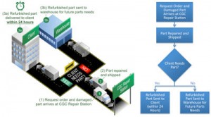
Stories are far more memorable and influential compared with stray facts or stitched sentences. Use a graphic metaphor, analogy or simile to tell the story of your solution. Walk the reader, step-by-step, through your solution. Start at the beginning and end with the solution. I choose my narrative and graphic based on my audience. The following graphics tell the same story and both do it in very different ways. There is a time and place for each.
I supported a $500 million dollar proposal where the competition was stiff. Anyone could win. We created a graphic that told the story of the customer getting exactly what they wanted—showing the customer’s perfect outcome using the solution proposed. We won and the feedback confirmed that our overview graphic was one of the reasons for the win.
3. Three Graphic Types
There are three basic graphic types I see in most winning executive summaries. They are as follows:
- Literal graphic. Literally show your solution.
- Parts to a whole. Show how each part of your solution connects to deliver the solution.
- Process diagram. Walk the evaluator through the process one step at a time. These graphic types work together and are not absolute. I have used other graphic types, but these are the three I use most often.
4. Step Up and Stand Out
Evaluators are just like you and me. They make quick judgments based on what they see and read. We say our company is the best-of-the-best. If so, our proposal better prove it. Poor graphics (made by untrained designers using clip art and clashing colors with inconsistent or common graphics) and bad writing (written by untrained writers with poor spelling and grammar, hard-to-follow descriptions using passive language) scream that our company is unprofessional, unreliable and may fail to deliver.
Taking the extra effort to develop professional, compelling content and graphics is expected. Failing to include proposal experts means that saving money is more important than winning. (Have a realistic budget and stick to it.) I always take my proposals to the next level and eclipse my competition by using proposal professionals.
5. Customer Focus
The executive summary is about the customer NOT us. The only information about us worth sharing is specifically related to how we will solve our customer’s problem. Stop including the year the company was founded if it is not a step in the executive summary level solution.
I usually start and end with the customer. I begin with their needs and challenges and end with the perfect solution. The client should be the focus from planning and early sales/capture activity to the delivery of the proposal so the graphic depiction should also start and end with the customer.
Most proposal professionals are hesitant to succinctly state the perfect customer solution (e.g., increased efficiency with a 38% reduction in cost is delivered by our solution). One reason many writers fail to state the perfect solution is the fear that they may get it wrong. If we are the right solution provider, we must pick a path and have a clear message. Either we understand the customer or we don’t. If we do not truly understand the customer, then we should not win.
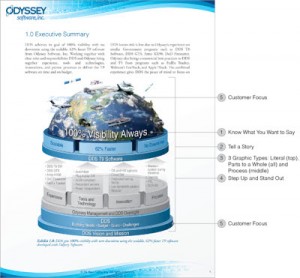
Let’s take a look at these five secrets in action on the following executive summary page.
1. Know What You Want to Say
The customer (DDS) wants “100% visibility always.” The text and graphic explains how this is achieved at a high level.
2. Tell a Story
The text and graphics build the story from the ground up of the customer achieving their goals within their perimeters.
3. Three Graphic Types
All three graphic types are used in the graphic: literal, parts to a whole and process
4. Step Up and Stand Out
The page design, graphics and content clearly communicate that extra effort was taken. The page quickly shows that this proposal and the customer’s solution are important.
5. Customer Focus
The content and graphics start and end with the customer. The solution provider is an enabler (not the focus).
Show how the customer is your main priority, how you understand their problem and how you can deliver the best solution. If you capture your pitch in the very beginning of your proposal, then you will capture your client’s attention and win the work.


Recent Comments