Every month, we add new PowerPoint graphics to Get My Graphic. For June, we created several graphics based on suggestions from our users. Here are a sampling of these images and how you can use them to communicate your ideas visually. Download them at Get My Graphic or be inspired by these ideas to create your own visual metaphors.
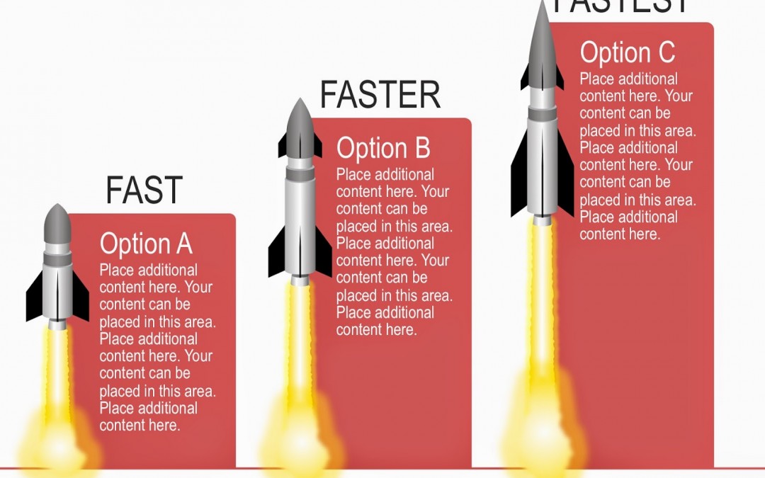
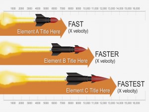
What better way to depict the quickness of your service than with a rocket? A bar chart is used to compare amounts, and adding a rocket icon to a bar chart that depicts process or service speeds will communicate the value of each option or element. Use this graphic to compare internet, download and upload, data, or assembly speeds.
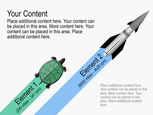
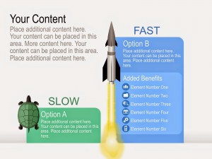
If your new process works faster than the older one, then visually show how much faster. Using a turtle to represent a slower option and a rocket for the faster version will instantly communicate the benefit for switching or upgrading to a new service or process. Consider animating the icons to make the graphic more memorable and keep your audience’s attention.
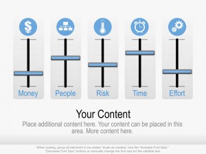
A gauge graphic is a perfect visual metaphor to compare elements and their importance. Animate the equalizers to show changes over time or as milestones occur.
PowerPoint Illustration Graphics
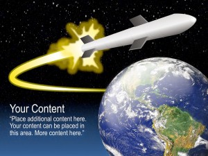
A rocket soaring into space is a visual metaphor for reaching goals, exploration, and pushing an organization’s limits and boundaries (i.e., reaching for the stars).
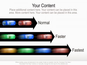
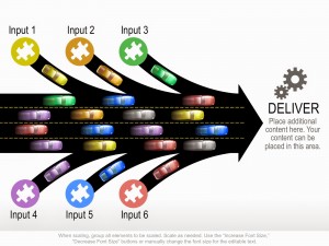
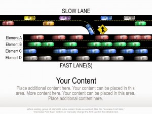
A highway or road can visually represent many types of processes or systems: the internet, data servers, intranets, web servers, corporate communications, call centers, computer networks, etc. Use the road graphics to compare system speeds, inputs, data processing, and downloading and uploading files to a network.

Recent Comments