When was the last time you saw a memorable presentation that raised your eyebrows? Most presentations look and sound similar. So, how do you differentiate? The secret is to do things that are obviously helpful. The following are five proven ways to ensure your presentations stand out and rise to the top:
Do the Unexpected
Content isn’t king, contrast is. Humans pay attention to that which is different. Do the opposite of what others are doing. For example, consider the following options:
- Don’t use slides. Instead, use a whiteboard and simple drawings (e.g., stick figures).
- If your slides are typically text-heavy, use visuals, a single photograph or a single word per slide.
- Consider summarizing your presentation in an infographic.
- When possible, use a non-standard (legible) font or layout.
- Use clever transitions, animations, or builds to better explain your ideas and connect your presentation into one cohesive story.
- Engage the audience with interactivity (e.g., questions, relevant physical examples to hand out, live demonstrations that support your assertions).
Most thought leaders have touted that design is the best way to stand out because aesthetics quickly evoke a strong emotional response. What we see helps our brains distinguish one thing from another and usually results in split-second judgments.
Focus on What is Unique and Beneficial
What is it about the content you are presenting that is unique, superior, or special? Perhaps, it is a tool or procedure that makes it easier for the audience to do their job. Whatever your answer, highlight it in your presentation and clearly show how it helps the audience achieve their goals.
Make It Easy
Highlight the benefits of your presentation on each slide. Make it clear how the information on each slide helps the audience. Connect the dots between your content and the audience’s goals. Keep it simple and make it completely obvious.
Other approaches include the following:
- Start with a clear, benefit-driven message and prove it throughout the presentation.
- Include a powerful, succinct, audience-focused “Cheat Sheet.”
- Use a “quick compare table” to compare your content / solution with alternative content / solutions.
- Use the same vocabulary as your audience.
- Have one speaking and writing style and one voice with clear, compelling content.
Keep it Simple
Most presented content is complex but our explanation doesn’t have to be. Einstein said, “If you can’t explain it simply, you don’t understand it well enough.” Authors of presentations communicate as if their customers are just like them. Most presentations include bullets that stretch over two lines with nonlinear explanations and puzzling, illegible diagrams. Unwanted complexity is a stumbling block because the confused mind says no. Keep your slides and explanations simple and provide detailed slides as backup information, when needed.
Prove It
Validate key assertions. For example, prove a qualitative statement with evidence such as testimonials, past performance stories, and quantitative charts. Validating important content builds trust.
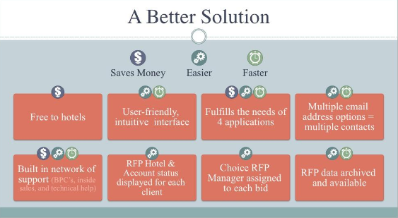
The following slide demonstrates four of the five approaches. The unique benefits are listed at the top. The information is simplified, making it easy for the audience to understand and connect the features presented with the benefits. The content in the orange boxes support and prove the benefits.
Use these five approaches together to ensure your presentation stands out in a sea of presentations.
Mike Parkinson, Microsoft MVP and APMP Fellow, is a graphics and presentation guru, marketing expert, and professional educator. Fortune 500 and small companies, government agencies and educational institutions work with Mike to achieve their goals.
Contact him at mike@billiondollargraphics.com, 703-608-9568, or visit www.BillionDollarGraphics.com.


Recent Comments