At the Presentation Summit this month, several Get My Graphic users offered the same suggestion for new graphics.
Can you add infographics to your site?
This suggestion got our attention, since we consider most of our graphics to be information graphics according to the Oxford Dictionaries definition:
A visual image such as a chart or diagram used to represent information or data.
By this definition, an area chart, looping graphic, or a pyramid graphic—to name a few of our categories—could be considered an infographic. However, our users perceive infographics as a collection of visuals that come together to tell a story about related data for a concept, theory or process.
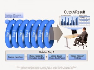
You can use Get My Graphic visuals to piece together an infographic, as we’ve done below with a spiral development graphic. We added bar and flow charts and a photo to a spiral graphic to tell a story about a company’s process.
To offer new ways to visualize information, we’ve added a dedicated infographic category and created graphics based on user feedback. Below are a sampling of our new infographics and ways to tailor these editable PowerPoint graphics to display your information.
The icons on these graphics are vector based. Colors can be changed, text updated, and pieces removed for use on other slides or in other graphics.
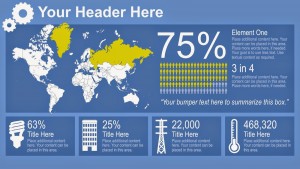
Highlight countries to talk about population growth, industry trends, disease rates, education, technology, or telecommunications across the world and how it relates to energy consumption, business startups, policy changes, or global warming.
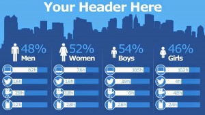
Compare percentages of social media, technology, elearning, or video streaming used across a population of a specific city, state, or country.
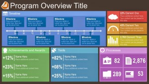
Use a central timeline for your company’s milestones. Show how the milestones relate to awards, implementing new tools, and creating new processes and how these tie into actionable data gathered on the cloud through a gauge graphic or in a bar chart.
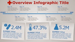
This timeline combined with icons of prescription pills, thermometer, and a laboratory flask can display information related to medical evaluations, disease treatment and containment, or research developments.
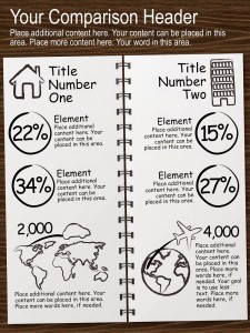
A spiral bound notebook opened to drawings of a globe, map, house, and building can describe moving employees or businesses, expanding companies, shipping logistics, globalization, or household versus business expenses.


Recent Comments