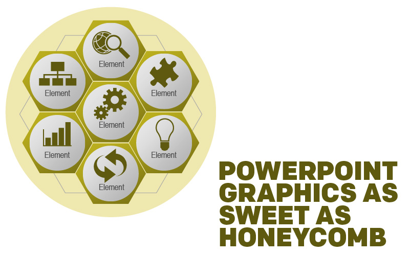
Bees. Although they are disciplined and hierarchical, there is still something quite whimsical about those little creatures. Buzzing like a helicopter from flower to flower, spreading pollen to enrich the local flora, and creating that sweet, syrupy nectar we know as honey.
As you may be aware, bees store this honey in a latticework of waxy tessellating hexagons called a honeycomb. These surprisingly geometric cells of honey are a little reminder that we as humans are pretty clever, but we’re not completely alone when it comes to certain kinds of intelligence.
We have an abundance of graphics in our library that mimic those hexagonal beauties that bees so naturally produce, and they can be used for a variety of different presentations. Turns out that honeycomb can be used for more than just honey!
Processes
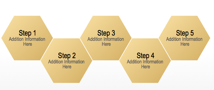
This is perhaps the most straightforward graphic of the group. If you want to convey a certain process or any kind of sequential information, you can easily write in the steps in each hexagon, describing the methods in a more dynamic way than just a numbered list.
Groups and Systems
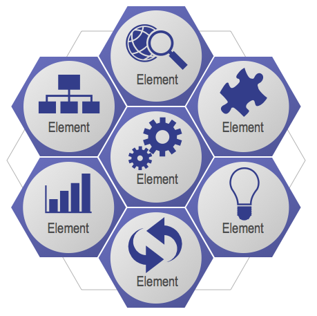
Just like a real-life honeycomb stores a lot of honey side-by-side, this honeycomb can group related bits of info into a neat clump. For instance, you could use this graphic as a way of introducing or wrapping up a group of topics that you want to cover in your presentation. You might have a presentation about aviation, and each hexagon describes a different aspect of that. One hexagon could be plane controls, another one whether conditions, and so on.
Data-flow Systems
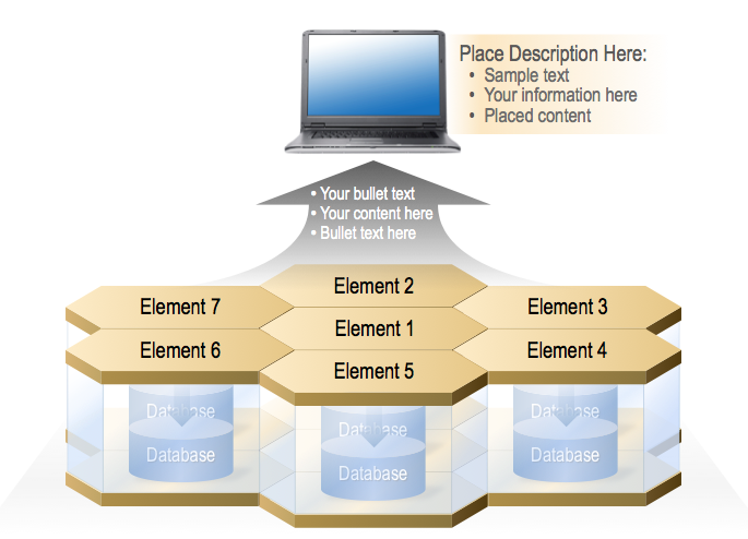
A lot of different types of information need to be funneled through you computer to make things work. Consider the webpage you’re looking at right now. It’s using HTML and CSS, two different coding languages, but both are required if you want a webpage that doesn’t look like it was designed by Alan Turing himself on the first computer ever.
In regards to the above graphic, you might consider the laptop at the top to be the end product you get from the cooperation of all the different systems. Each of the elements could be different sources of code or protocol, each of which is drawing from its own database before being combined into one to give you what you see on your computer screen.
Simplification
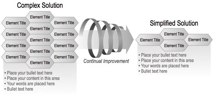
Though it’s unclear if he really did say it, Leonardo da Vinci is often quoted saying, “Simplicity is the ultimate sophistication.”
Regardless of who said it, it’s an adage we should all remember. Just because something is more complex, that doesn’t mean that it’s going to be better.
The above graphic is a brilliant way to express this principle. Simply described, put a complex system in the large clump on the left side and show the improved, simplified model on the right.
If you want these or various other hexagon-shaped PowerPoint graphics, buzz on over to our PowerPoint library!
Recent Comments