
Research supports that visuals improves understanding, recollection and adoption. Many educators use stock photos and easily accessible educational graphics and infographic elements such as puzzles, bar charts, and flow charts. Don’t stop there. There is a sea of options. Below are ten seldom used graphics that have proven extremely successful at communicating a host of concepts in your educational materials.
- Bridge Graphic
Click to start download process.
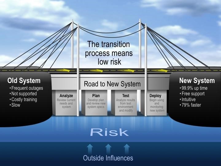
This graphic is a metaphor depicting the connection or transition between two actions, concepts, or entities. A bridge connects two separate pieces of land. It crosses over rough water or highways to allow vehicles and pedestrians to safely pass. A bridge graphic is a perfect way to show transition and the steps to do so. Process solutions (overcoming the risky waters), system integration, and many other concepts can be succinctly communicated using a bridge graphic.
- Chain Graphic
Click to start download process.
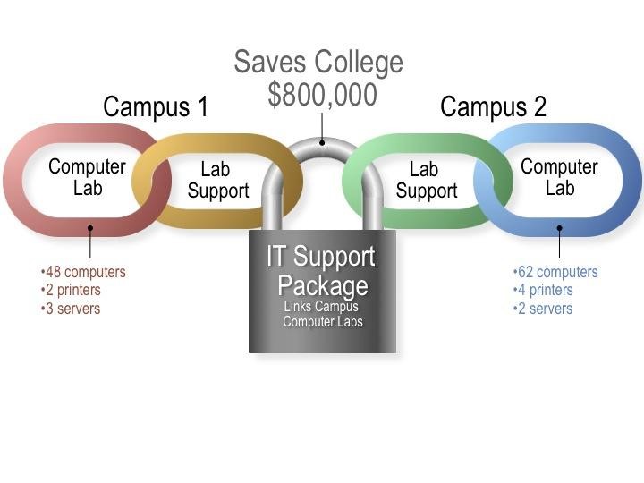
Chain graphics show “linked” actions, concepts, or entities. Alternatively, chains illustrate restraint or security. Instead of a Venn diagram, what about a chain diagram? Instead of showing linked concepts with boxes and lines, show a chain of departments, processes, or people to convey the same idea. Use a lock to show a (secure) connection between actions or departments. Or just overlay the chain on top of items to demonstrate security.
- Conveyor Belt Graphic
Click to start download process.
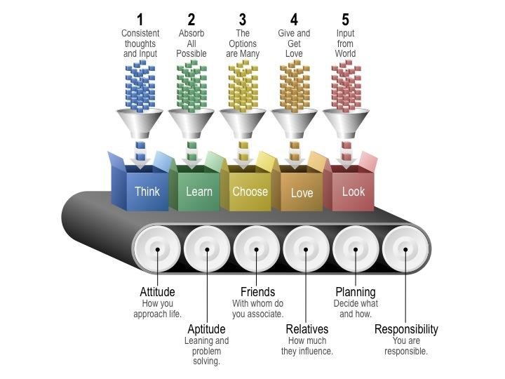
This graphic is a metaphor that depicts a repeatable linear process. Conveyor belt graphics are a great way to show forward movement in a process such as assembling a product, recruitment and training steps, lifestyle enhancements, course overview, or system development.
- Dashboard
Click to start download process.
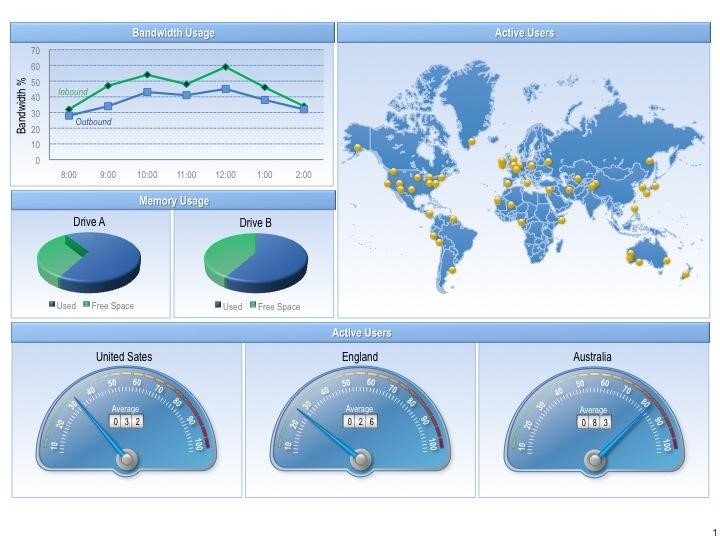
Dashboards present multiple metrics—using multiple graphic types—in one consolidated format. It is a “holistic” view of information. On multiple slides or pages you may have pie carts, a map, a line chart that all relate to each other. Why not put these objects on one introductory slide or page to help your audience reach a desired conclusion. Dashboard graphics are best for sharing and learning quantitative information.
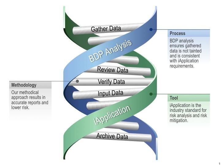
- DNA Graphic
Click to start download process.
This graphic illustrates the synergy of multiple actions, concepts, or entities. Together they combine to create a new, better solution (and breath new “life” into the project). The strands of the DNA can represent two key concepts (like a software tool and a corporate process) with the chromosomes connecting the two via common elements (like activities needed to combine the strand content).
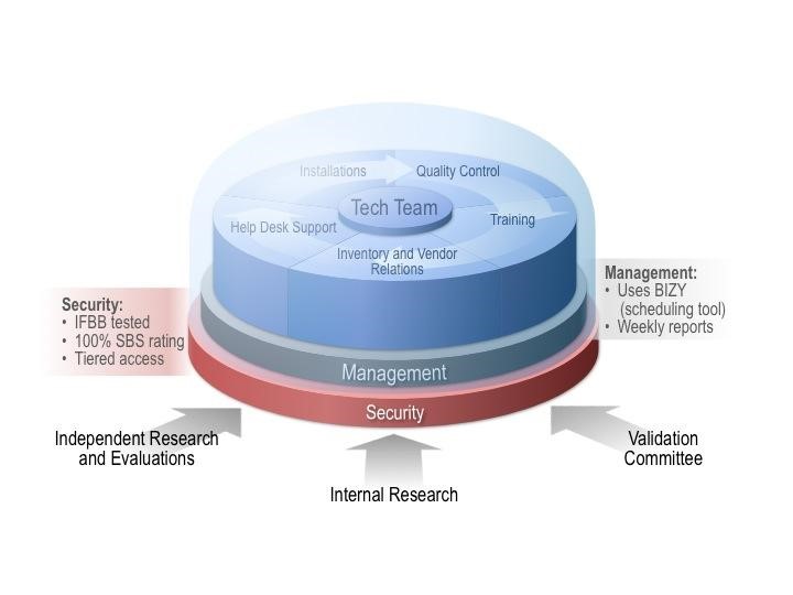
- Dome Graphic
Click to start download process.
A dome graphic looks like a “snow globe” illustrating the containment of elements. The dome graphic is great at communicating protection and security. Generally, you combine a “stacked graphic” (shown here) with the dome to show levels in a system, process, or methodology and how the levels relate to one in a secure environment—the dome.
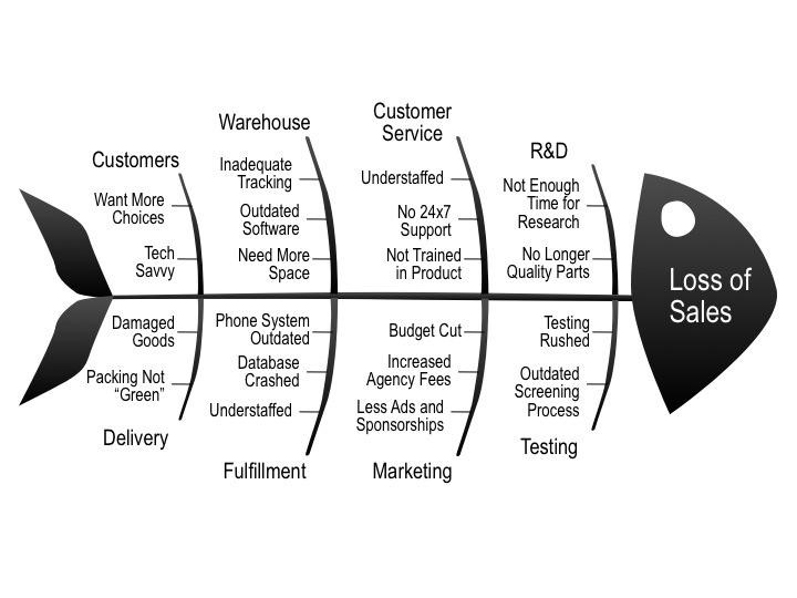
- Fishbone Diagram
Click to start download process.
This graphic shows all factors that have an effect on a problem or objective. (Think cause and effect.) The small bones can represent categories, strategies, processes, and departments that join at the spine to create the final outcome.
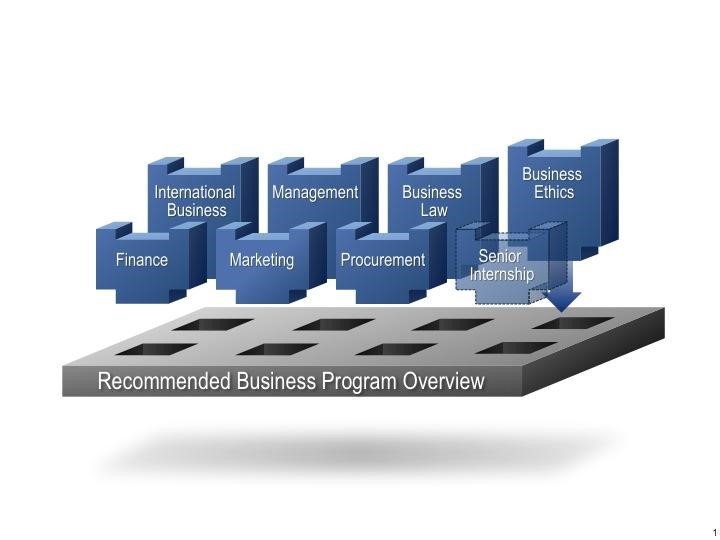
- Peg Graphic
Click to start download process.
This graphic shows the interconnectivity of actions, concepts, or entities to create a unified whole (think Legos®). Use a peg graphic for systems connecting and interacting with one another, building of a process, or departments coming together to form an improved or upgraded solution.
- Pipe Graphic
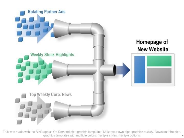
Click to start download process.
This graphic metaphor represents the isolated flow of elements. Instead of using a flowchart, use a pipe graphic to represent concepts like consolidation, synthesis, or combination. Inversely, a pipe graphic can illustrate dispersion or diffusion. Pipe graphics are versatile and can communicate a wide variety of concepts.
- Road Graphic
Click to start download process.
This graphic is a metaphor depicting the path between the “as is” or “before” state to the “to be” or “after” state. Like the bridge graphic, a road graphic can show transition and a connection for a process or system. A road graphic is perfect for demonstrating a “future state” or a long-term goal that is “down the road.” It could also be used as an ending to a presentation to illustrate the goal reached at the end of the process. Make sure you check out our extensive library of over 10,000 PowerPoint graphics by starting off with a 7-Day Free Trial.
Mike Parkinson, Microsoft MVP and APMP Fellow, is a graphics and presentation guru, marketing expert, and professional educator. Fortune 500 and small companies, government agencies and educational institutions work with Mike to achieve their goals.
Contact him at mike@billiondollargraphics.com, 703-608-9568, or visit www.BillionDollarGraphics.com.
Recent Comments