
Many times I see presentations and marketing materials and even websites using “razzle-dazzle” fonts that aren’t readable or even appropriate. There are so many typefaces from which to choose, it can be daunting—not to mention various styles within each font family. So here are a few rules I employ when choosing a font for my project:
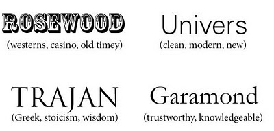
- Geetesh Bajaj of Indezine.com recently sent me a link for a poster that graphic designer Julian Hansen created to help people (in a very interesting and cheeky way) find the best typeface for their project. Check it out here. What I find most interesting is the text in the center which directs the reader on how to use the poster: Start out by choosing the kind of project that you’ll need your typeface for. Just like choosing a style for your graphics, you want to understand your project’s goal and then choose the appropriate typeface for your project. You wouldn’t choose a whimsical font for the intro page of a company’s website that supplies defense equipment to the government. Each font has an intrinsic meaning which your audience will subconsciously pick up. Underneath each typeface below is my impression of it; yours may be different. Always keep your audience and goal in mind when choosing a font.
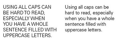
- Use ALL CAPS, bold face, and italics—sparingly. I cringe when viewing presentations where bulleted sentences are entirely in uppercase. Not only does it seem like SOMEONE IS SHOUTING AT ME, but sentences in all caps are harder to read. I suggest only employing all caps for short titles and headings where you use small words or just a few words.
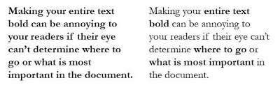
I’ve felt annoyed reading brochures where all the text is bold. Annoyed because I don’t know what is important. A bold typeface is a great way make essential phrases and concepts stand out from the rest. I apply bold to headings, subheads, titles, and key words within a paragraph. You run the risk of confusing your readers–and possibly annoying them–if your entire document uses a bold typeface.
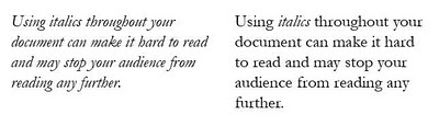
I’ve gotten a headache reading pages of italic text. Again, italic fonts should be used to make certain text and ideas standout. Because of the way the letters lean, it can be hard to read, which may turnoff your audience and they won’t be willing to read more to learn about your product or service or concept. Consider using italics to highlight important ideas, in a heading or subhead, for a pull quote, to set off a paragraph quoting another source, or for reference or book titles.
- Use a ubiquitous font if other people will be working in or editing the document or presentation. Unless you can embed the font and are sure it will travel with your document, then stick to a font like Arial or Times New Roman. They are simple but will get the job done, especially for presentations. In a few instances, I designed my presentation on the Mac and needed to load it on a PC for delivery. I couldn’t risk font substitution and would’ve needed to buy and load a PC version of my font onto the other computer which belonged to someone else, so that wasn’t an option.
- Don’t use more than 3-4 typefaces in one document. It can get messy—and confusing for the designer working on the project and your audience—if you throw in Goudy with Garamond with Futura and a touch of Univers. When using fonts that are close in structure like Futura and Univers, you run the risk of your document appearing awkward. Your audience will subconsciously pick up on the subtle differences between the typefaces from one paragraph to the next and it will put them off—like wearing navy blue and black. They are too close in color that it seems off when you try to pair them. Check out every aspect of the font before you choose one: What do the numbers look like? Will the punctuation print well? You may love the appearance of the letters but the numbers or punctuation may be odd. Remember, the less variety of typefaces you use, the cleaner your document will look and the more people will want to read it. If you want help in determining what fonts work well together here are two sites that offer some great suggestions: 19 Top Fonts in 19 Top Combinations and Typefaces that Work Together.
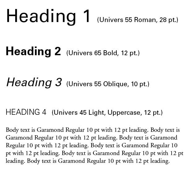
- Determine a font style for your document in the beginning. Your company may already offer a style guide that lists appropriate fonts for outfacing materials. If you’re unsure, ask. It’ a great resource to have and you want to tie in the font and colors used in your company logo to any marketing materials. You want to keep all the materials consistent because consistency breeds trust. Whenever I begin a layout on a document (either a brochure, catalog, or presentation), I first determine my typeface for body text, headings, any callouts or pull quotes, footers, footnotes, etc. My favorite look is to combine serif and sans serif fonts. I use sans serif for the main headings and serif for the body text. I find serif fonts easier to read in printed materials. (Think books. Most books contain a serif font for a reason.) I did learn recently that many website designers prefer sans serif fonts for websites because they feel it looks cleaner on the screen and is easier to read. The preference is up to you. But I recommend maintaining the same font family (or font combinations) throughout your materials to keep your documents clean and consistent.

These are my basic tips. There are many others that I also employ, and I found several websites with great advice in addition to the rules I just put forth:
Dynamic Graphics
Foam Train Fonts
Web Designer Depot
Zimbio
Recent Comments