Ellen Finkelstein, Microsoft PowerPoint MVP, shares some of her extensive slide design wisdom on our blog today. Subscribe to her newsletter for more tips and resources from an expert with almost 20 years of presentation experience.
____________________
In working with clients, I’ve seen certain issues come up repeatedly and have come up with 13 easy-to-use techniques that look great. In this article, I’ll cover 8 of those techniques to help you deal with slide layout, images, and text.
1-4. 4 LAYOUTS THAT ALWAYS LOOK GOOD
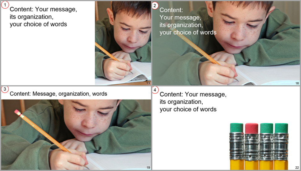
One problem many non-designers have is how to lay out their slides. The more components you have on a slide, the harder it is to design a clear, coherent slide. There isn’t room in this post for a full coverage of design concepts and most people want a shortcut, anyway. So I came up with 4 layouts that always look good. These layouts work when you have a small amount of text and an image:
- (1) Half-vertical: This layout puts the text on one side and a vertical image on the other. The image does have to be exactly half of the slide. The image should be up against the edges of the slide.
- (2) Full slide: In this layout, the image covers the entire slide. The slide title is on top of the image. You’ll often need to put a semi-transparent rectangle between the text and the image so that the text is easily readable.
- (3) Title & image: This layout solves the problem of illegible text because the image goes below it. The image is still up against the slide edges.
- (4) Diagonal: Here, you put the text at the top left and the image at the bottom right. This works best when the image’s background matches that of the slide or when you remove the image’s background.

In most cases, you’ll need to crop the image to fit the layout. Cropping is a good thing, as it often lets you cut out some of the background and focus on what’s important.
5-6. IMAGE TREATMENTS
Techniques 5-6 help you format images. You can make your images look a lot more polished using these techniques. Just placing a plain image on a slide looks boring.
- (5) Use the snapshot look: By adding a border and rotating the image, you get an informal snapshot look. Luckily, this is easy! Select the photo, click the Format tab, click the More down arrow to the right of the Picture Styles thumbnails, and choose “Rotated, White.”

- (6) Remove the image background: The background of an image is often irrelevant and distracting. To remove a complex background, you need PowerPoint 2010 or later. Select the image and display the Format tab. Click Remove Background. A rectangle appears; everything outside that rectangle is magenta and will be removed. Drag the corners of the rectangle (usually outward) to include everything you want to keep. Then use the Mark Areas to Keep and Mark Areas to Remove buttons to drag across areas that need to be adjusted. When you’re done, click Keep Changes.
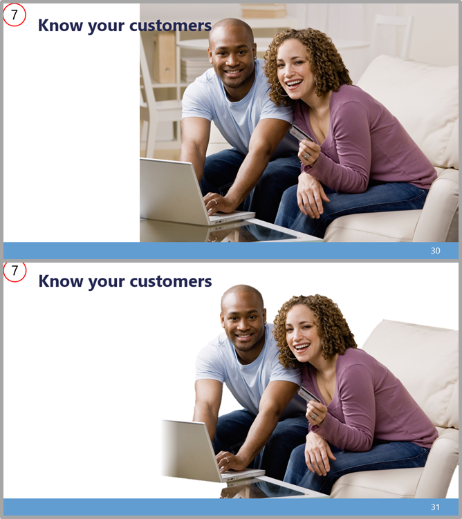
Here you see a slide before and after removing the image’s background. Doesn’t the after example look cleaner?
7-8: MANAGE THAT PESKY TEXT!
You’ve probably heard that presentations should be as visual as possible, but my guess is that in practice, you still have a fair amount of text left on some of your slides. These techniques help you manage that text, making it easier to understand and more visual.
- (7) Reduce the levels of text: I often see 3 or 4 levels of text. For example, there will be a slide title, a sub-heading, and bulleted text. Instead, incorporate the sub-heading into the slide title – make your slide titles more meaningful – and you’ll see that your slides are clearer.
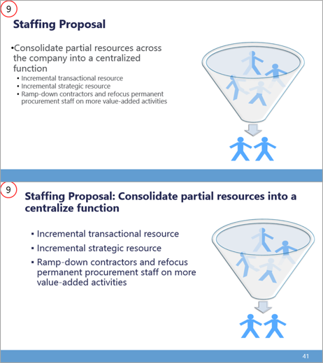
Here you see a before and after example. The bulleted text is exactly the same, but by moving the subheading to the title, the slide is much easier to understand.
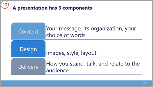
- (8) Separate out important text: When you have a lot of text on a slide, separating out a word or two can make all the difference. And easy way to do this is with the Tab List SmartArt design, but you can also use the Vertical Block List. Set up your text so that your main text is first-level text and the rest is tabbed in, as you see in this before and after example. Then click Convert to SmartArt on the Home tab, choose More SmartArt Graphics, and choose Tab List or Vertical Block List.
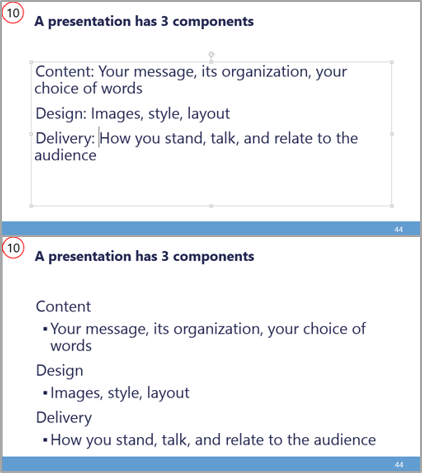
Here you see the result using the Tab List design. Can you see how this technique will help your audience understand and remember your points more clearly?
SPEND LESS TIME AND GET BETTER RESULTS
When you have a repertoire of techniques, you spend less time fiddling with your slides, so you save time. In addition, you get slides that are clear, powerful, professional-looking, and persuasive. Take the time to try these out and see what results you get!
Recent Comments