We’ve all heard the phrase, a picture is worth a thousand words. Just because there is some open space on a page though, don’t get lazy and place some meaningless gratuitous image. We always recommend finding a way to create an image that engages learners and effectively communicates a message.
Instructional graphics are great training aids and can make the difference between an average course and a great course. Graphics come in many shapes, sizes, layouts, colors, and complexities. They are more than just a simple picture of a person or an office. Graphics can portray steps in a process, pieces of a concept, interaction between people, emotions, and much more.
The true test of an instructional graphic is if we can look it and understand the concept without reading the supporting text?
The challenge is, to create effective instructional graphics can be time consuming and costly. To help with this, we made over 9000 pre-made PowerPoint graphics and offer them within our PowerPoint Graphics library. The graphics are 100% editable within PowerPoint and can export in nearly any software.
Lets take a quick look.
Notice that every aspect in this graphic is completely editable. So as long as we can Type, change colors, and can ungroup, we can change every aspect.
If we were to scale this graphic, notice the fonts look a little odd. To fix that, go to the home tab, and choose decrease font size until the font looks as we want it to. If we wanted to bring this graphic into another application, group all elements together, right click and save the graphic out. Note, to maintain a transparent background, choose the .png file type.
Lets take a look at another graphic. As with the previous, we can change every aspect of it. So for example, to highlight a specific region on the map, click on it and simply change the color. We can change any of the styles, lines, weights, shadows. Any aspect of it because it is vector artwork. Which means it be scaled to just about any size and maintain its image quality. We can also change any aesthetic aspect.
This is a dashboard graphic. We can change the data associated with quantitative charts. As we change the quantity in the Excel popup, watch the pie chart to the left adjust. Change it by simply modifying the excel popup or editing the data from within powerpoint.
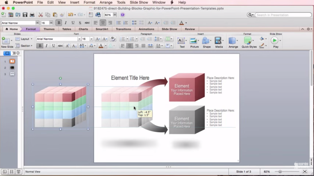
Another graphic is a pipe graphic. We’re going to quickly edit the style. To edit style, change aesthetic elements associated with it. So for example instead of being a gradient fill, we can change it to a solid fill. We can outline it and change the line weight. We can also change shapes. So if we don’t like cubes and would rather have spheres. Simply change the shapes to circles. If we wanted to get rid of the arrows, click on and delete them. We can change every aspect. We can change the style and the look and feel, within seconds.
Heres a pyramid graphic. With some graphics, we get a lot more elements than we need. So for example, let’s say we only need 8 layers on the pyramid graphic. We would ungroup the graphic and delete the elements we don’t need.
Let’s say we only need 2 segments at the bottom. To do this, I would click on the separators and and text boxes and delete those that I don’t need.
Heres a little trick. Everything is grouped logically. Ungroup this pie chart, or stacked graphic and notice how each layer is grouped as one unit. If we wanted to isolate just one of the pie wedges, simply ungroup it one more time and pull the pie wedge out.
(map)
Heres a map graphic. To modify any of these connecting lines, click on them, delete them, or grab the end point and scale to connect anywhere.
Heres another trick. So lets say we want to change all of the spirals to be the same color. Select the colored element you want, and use the Format Paint brush to apply the same color treatment to each element.
Our PowerPoint graphics are unbelievably easy to work with. With over 50 categories of graphics, you’re sure to find some for your next project.
Recent Comments