Recently, I gave a webinar through PresentationXpert. Before and during my presentation, the audience was encouraged to ask questions, and I was surprised at the number of questions concerning color choice.
However, these concerns shouldn’t have surprised me. Color is an important element of a presentation. Not only can color affect mood, it can communicate your brand and set the tone for your presentation and marketing materials. Color is one of the first details chosen when setting up your corporate logo, website, letterhead, and presentation templates. Finding colors that work well together—and fit with your message—can be a challenge even for seasoned designers.
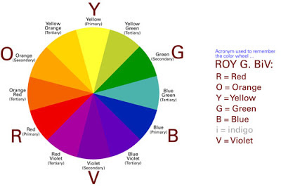
Before I give you suggestions on how to choose colors, let’s review the color wheel:

When speaking with a designer about colors, here are terms to help you communicate your color needs more accurately:
- Hue – where on the color wheel the color appears
- Saturation – the intensity of vibrancy of the color
- Value – the lightness or darkness of the color
- Analogous – colors that appear next to one another on the color wheel like blue, green, and yellow
- Complementary – colors that are across from one another on the color wheel like red and green
Analogous colors are often the better choice when developing your color palette because complementary colors vibrate when next to one another. Have you ever seen a website with a blue background and red text? Is it inviting? Does it make you want to read more? Or does it give you a headache?

So, how do you determine which colors to use?
As with designing a graphic, you need to determine your primary objective when choosing a color. If you are trying to win new business with a presentation, then integrate your potential client’s colors into the template. People like to see themselves, especially their businesses, in your presentation. Seeing something recognizable in your presentation promotes feelings of trust and partnership. Consider if the two slides below were being presented to the U.S. Army. Which slide communicates that you understand this client?

On the flip side, if your goal is to brand your company, then use your corporate colors. I know you may not like those colors or are probably sick of using the same colors, but think about this: When you picture a Coke ad what color do you primarily see? If you saw a color other than red—maybe purple—how would that make you feel?
Coke and other heavily branded corporations infuse their ads and marketing materials and packaging with their company colors. Using these colors is almost as important as their logos or font choices in helping their customers instantly recognize their product.
What if you need to choose colors to complement your brand or maybe you are creating a new brand, how do you find the right colors?
Colors evoke different feelings in your audience and confer different connotations based on subject matter and culture. See how unappealing this pie slice becomes when the wrong color is applied.

Below is a list of colors and their meanings specific to many Western cultures. Keep these in mind when choosing colors to help properly convey your message.
- Red = empowering, bold (Red needs to be used sparingly. In studies, it has been shown to raise blood pressure and increase respiration rates, which will negatively impact mood.)
- Orange = warmth, happiness
- Yellow = happiness, energy
- Green = balance, refreshing
- Blue = relaxing, cool
- Violet = comforting
- White = pure, cleanliness
- Black = authoritative, shows discipline
I’ve found blue and green to be the safest colors when creating a new color scheme. Although, even I need inspiration when creating a template of colors with primary, secondary, and tertiary colors. Check out these sites to find that perfect color combination for your next project and colors to complement your corporate ones.
Recent Comments