Every decision, personal or professional, carries with it an inherent risk. Knowing the pros and cons before taking a leap can help you make an informed, calculated choice.
One way to weigh your options is to create a risk matrix diagram. It’s an easy method of getting all the variables in one place and visualizing the circumstances affecting your decision.
Decisions like these are often made by a large group of people as opposed to an individual, and as such will need to be reviewed by the body of people in charge. In these circumstances, it makes sense to present a risk matrix diagram to the group, comprising the research and data that currently exists in order to inform the decision-makers.
We have several customizable risk matrix PowerPoint diagrams available in our graphic library and we would like to highlight a few today.
Continuum
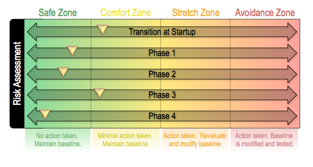
This is perhaps the simplest level of risk assessment. You have several items that require your attention and you need to figure out which deserves your highest priority. What can you safely ignore? What demands immediate action? Use this graphic to set priorities and determine when you need to make changes.
Likelihood vs. Consequences
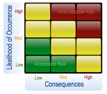
There are a couple things to consider when it comes to assigning a certain risk level to certain situation: how often will the issue come up, and how dire will the consequences be when it does happen? The above diagram can be used to weigh these 2 variables against one another and set a baseline for what is an acceptable level of risk. Does an issue have a low likelihood of occurrences and low consequences when it does happen? That’s probably something you can live with. Does it have a high likelihood of happening and dire consequences whenever it happens? That’s a risk you’ll want to steer away from.
Mitigation
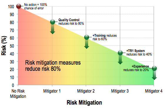
This graph allows you to chart the overall risk of a decision and what it will take to bring that risk down to a respectable level. It shows the continual decline of risk as more and more action is taken to fix the problem, showing the improvement that these mitigating factors can have on the overall level of risk.
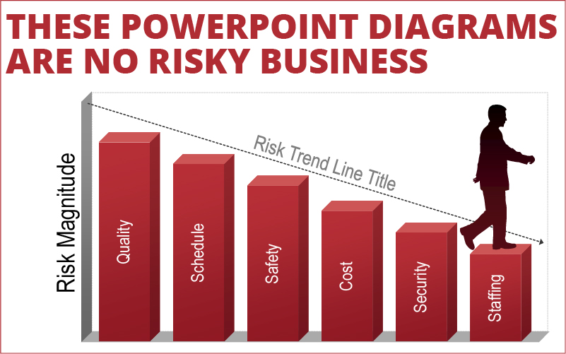
Multiple Factors
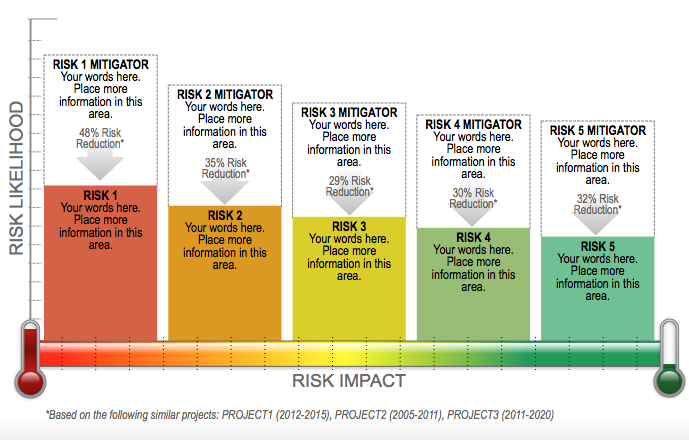
Sometimes you need show a lot of information in one compact diagram. This graphic allows users to chart the risk level of multiple different situations, rating them from most concern to least concern, and taking into account the mitigating factors of each, allowing for a full picture of the situation and easier decision making for your audience.
You can find these and many other handy diagrams in our PowerPoint graphic library. Check out our Free, 7-day trial and download today with no risk!
Recent Comments