Over the past couple months, we’ve gone on a graphic-adding binge here at Get My Graphics. All told we’ve created over 40 new PowerPoint graphics. Take a look at some of the highlights we’ve been working on, as well as a full list of the new batch of templates.
DNA
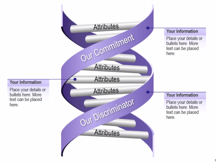
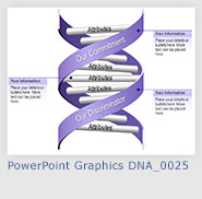
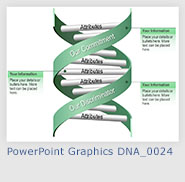
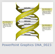
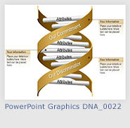
Awesome graphics come so naturally to us, it’s practically in our genes. We have some new varieties of DNA graphics. Depending on your purposes, you could use this graphic as literal model of DNA (just change some colors and add the appropriate labels) or simply as a metaphor for the component parts of a larger concept. The DNA could represent your company while each “rung” on the ladder represents a different aspect or quality of the company. These graphics make for great general overviews before delving into the nitty-gritty of each piece.
Conveyor Belt
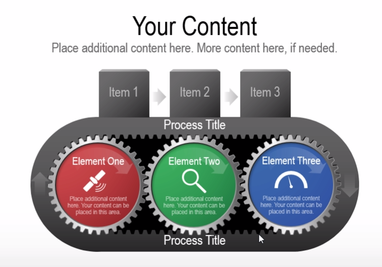
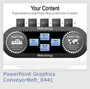
Nothing quite says “industrial” quite like gears and conveyor belts. Our conveyor belt graphics are great at illustrating methods and processes through the apt visual metaphor of factory machinery. Each process is influenced by multiple different elements, each in turn driving the work forward and accomplishing the the task at hand.
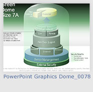
Dome
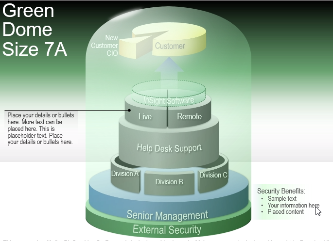
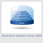
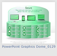
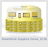
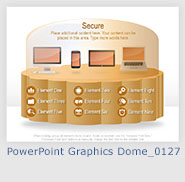
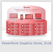
This dome graphic shows a visual hierarchy of people, groups, and ideas. Each group answers to the layer below it, while influencing the slice above. Included are several kinds of layers that can be used for various purposes. Many different colors are available to choose from as well as different levels of opacity, evidenced by the second layer from the top. See if you can diagram your company’s hierarchy of leadership with a few simple changes to this PowerPoint template.
 |
 |
 |
 |
 |
 |
 |
 |
 |
 |
 |
 |
 |
 |
 |
 |
 |
 |
 |
 |
 |
 |
 |
 |
 |
 |
 |
 |
 |
 |
 |
 |
 |
 |
 |
 |
 |
 |
 |
 |
 |


Recent Comments