
Three years ago, we created a Graphic Cheat Sheet to help our readers find the right graphic to communicate their ideas. We didn’t realize how popular it would become and how our audience would grab up Graphic Cheat Sheet posters at conferences and workshops. We’ve since revamped the layout and added new icons. You can download a FREE pdf of the sheet here:
Click this image to download.
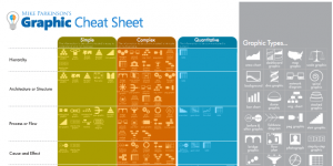
The Graphic Cheat Sheet offers you suggestions for graphic types that best convey various concepts in simple, complex, and quantitative ways. For example, if you want to show Synergy, scroll down the far left column to the row labeled Synergy. Under the Simple column (for information not too intricate), you will see suggestions like a building block graphic, chain graphic, or pyramid graphic. For more robust concepts of Synergy, you can look under the Complex column and find suggestions like a funnel graphic, ven diagram, collage, or a stacked graphic. For numeric concepts of Synergy, look under the Quantitative column to find a pie chart and dashboard graphic. Whenever you’re stuck with how to visually communicate your ideas, break out this cheat sheet! I created the sheet to give you new ideas for graphics and force you to consider different ways to show your information. Maybe for Hierarchy, you always used a pyramid graphic. However, in reviewing the sheet, you notice that a stair graphic or a temple graphic might work better and offer another way to visually communicate your information and keep your presentations and marketing materials fresh. The graphic types also correlate to the list under our Advanced Search feature on Get My Graphic. Hope this sheet helps you find better and more creative ways to communicate your ideas. As always, you can email me at social@getmygraphics.com with any suggestions for articles or other helpful resources or graphic questions.
Recent Comments