We are close to reaching our 10,000 graphic mark at Get My Graphic. Below is a sampling of graphics added this month and how you can use them in your presentations.
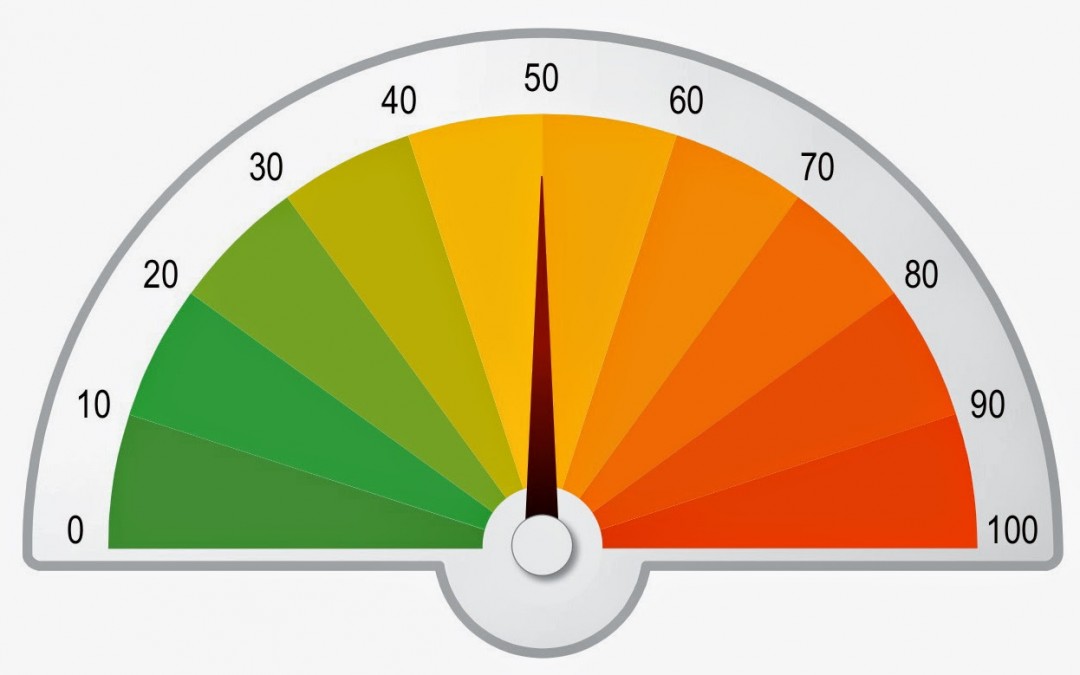
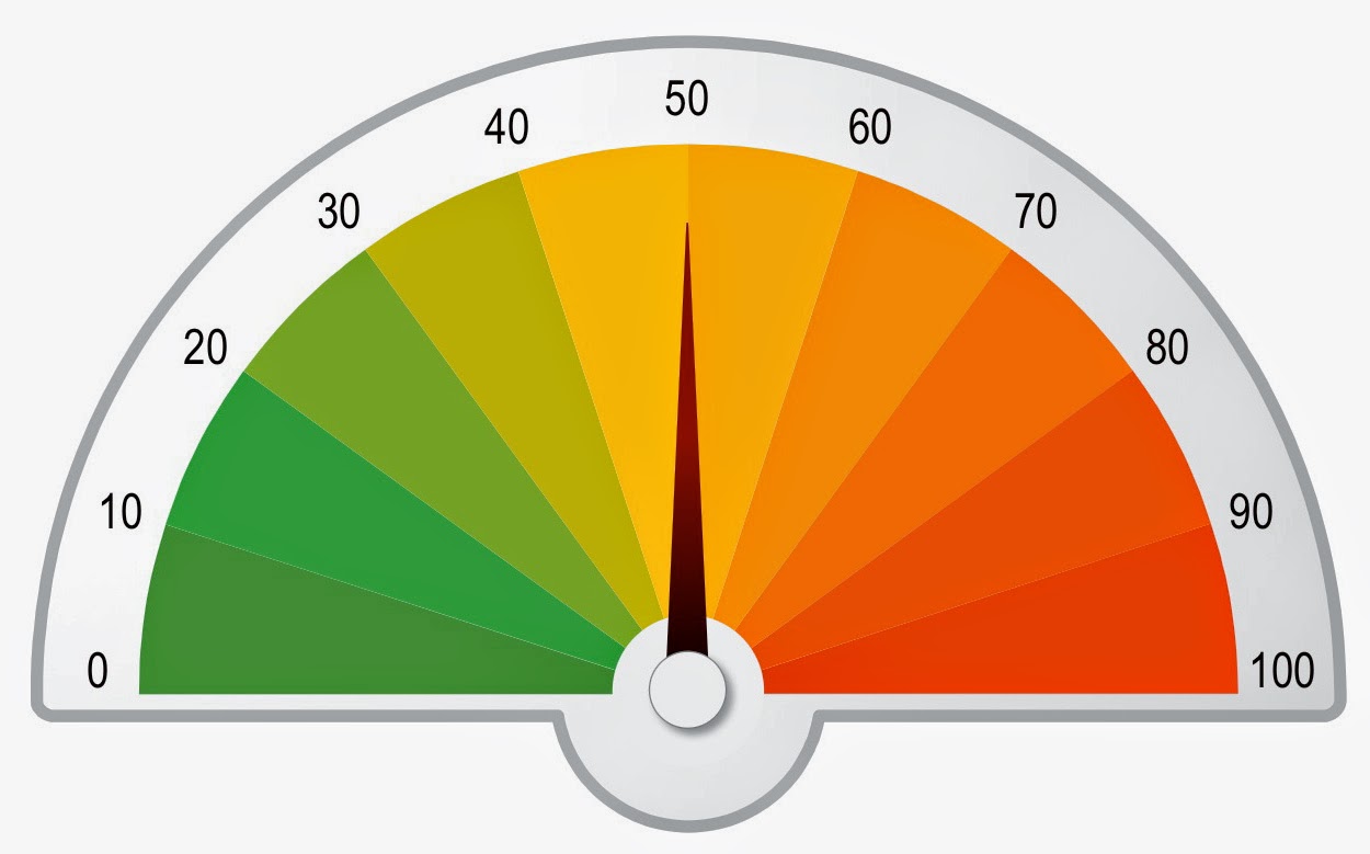
PowerPoint Gauge Graphics
Use the new gauge graphics instead of a typical risk matrix to show the risk level for a task, project, or process. Rotate the needle to the area corresponding to low, medium or high risk.
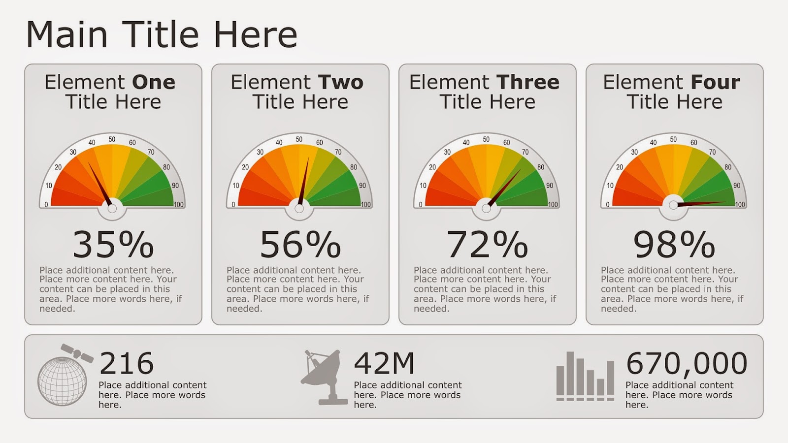
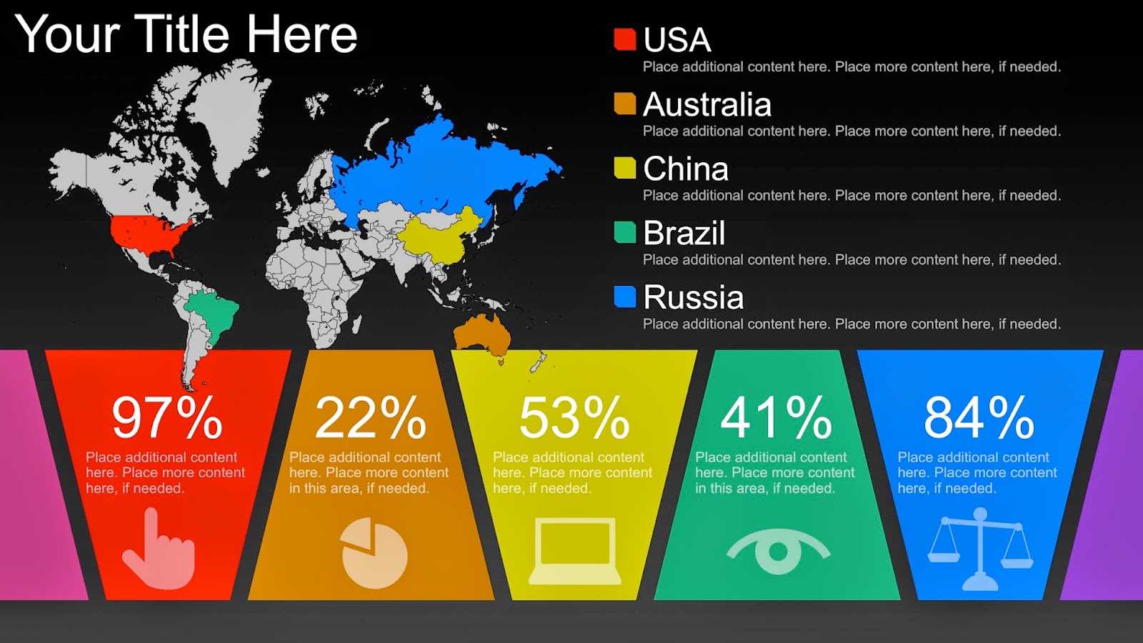
PowerPoint Infographics
Infographics incorporate several graphics and icons to tell a story with information.
Use this infographic containing gauges to compare risk levels of different tasks.
This infographic has a timeline to display events over years, months, or days. Compare data, speed, web, and documents with the icons over the time period.

Use this infographic with the fully editable map to highlight countries and their data, computer, or web usages and laws governing information streaming.
PowerPoint Tree Diagrams
Use Tree Diagrams as a visual metaphor or timeline for growth or emerging technologies. It is also a different way to show your organization with various “branches” sprouting from the main company.

Recent Comments