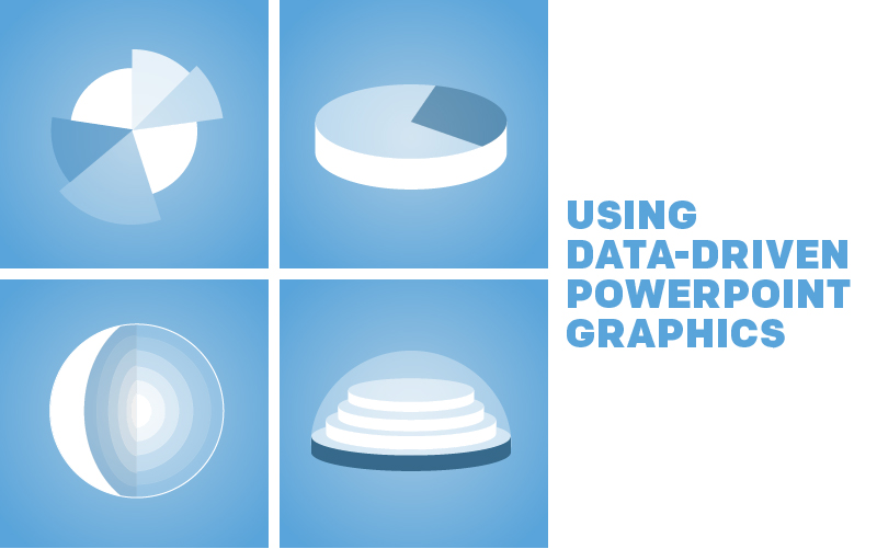
A little bit of data can go a long way with the right presentation. With graphs and charts, you can quite easily present that info in a quick glance. Our stylish data-driven PowerPoint graphics are excellent for quick info, and on top of that, they can be customized to suit your unique artistic tastes and statistical particulars.
Since most of the following graphics have similar user interfaces, we’ll get started by messing around with a simple bar chart.
Bar Charts Graphic
Customizing this template is an absolute snap.
Here’s the process:

Select chart.

Click Design

Under Design, click Edit Data.


Data corresponds to bar chart.


Change data to edit chart.
Radar Charts Graphic

Click here to view this template in the library!
Radar charts are ideal for side-by-side comparisons of the various attributes of several different elements.
For instance, say you were looking for a new city to move to. You have a few in mind, but you can’t quite decide. You could use a radar chart to compare the pros and cons of each city. Which city has the best average rent? Lowest crime rate? Access to local amenities? You get the idea.
Dashboards Graphic

Click here to view this template in the library!
The Dashboard is chock-full of possibilities. Text, design, and data are all completely at your discretion. Pieces can be added, removed, repositioned, or redesigned altogether. Some of the standard elements of the raw template are a 1-6 rating system, gauge graphics, a world map, and various text boxes. Just like the dashboard of your car, Dashboard presents a lot of information in a small space.
Let us know which PowerPoint graphics you like to use for your data in the comments below!
Recent Comments