by getmygraphics | PowerPoint Tips
With travel this week, I’ve decided to keep this blog short and to the point (as some of your documents need to be). When should you use a graphic when space is limited? Here are three reasons to choose a …

by getmygraphics | PowerPoint Graphics, PowerPoint Tips
Potential clients have fractured attention spans. Your target audience wants to quickly understand your solution and know why they should use your product or buy into your solution. Your goal is to make it as easy as possible for your …

by getmygraphics | PowerPoint Tips
The presentation process I teach is called U.S.E.—Understand, Summarize and Explain. Looking at the first step (Understand) there are three core elements: audience, need, and requirements (if applicable). To be persuasive, our presentation must resonate with the...

by getmygraphics | PowerPoint Tips
Meghan Dotter is the principal at Portico Presentations. Follow presentation content and delivery discussions @PorticoPR and The Present Better Blog at www.PorticoPresentations.com. Webinars are a great way to reach more people at a lower cost. They’re also a...

by getmygraphics | PowerPoint Tips
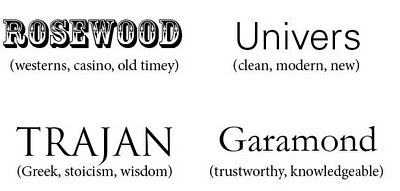
Many times I see presentations and marketing materials and even websites using “razzle-dazzle” fonts that aren’t readable or even appropriate. There are so many typefaces from which to choose, it can be daunting—not to mention various styles within...

by getmygraphics | PowerPoint Tips
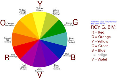
Recently, I gave a webinar through PresentationXpert. Before and during my presentation, the audience was encouraged to ask questions, and I was surprised at the number of questions concerning color choice. However, these concerns shouldn’t have surprised me....


Recent Comments